
On 5 October 1998, the ITV logo was changed to a lower cased blue and yellow. This was because previously, the grey, dull logo used before gave the impression to the audience that the channels content was a high brow, more mature, not aimed at younger audiences. ITV changed the logo to seem friendlier and more welcoming to younger audiences.

Designed by English and Pockett, the new look was used to look at the company’s new slogan, ‘TV from the heart’ therefore giving the channel a new identity. This new look would show the viewers that the channel has suitable content for younger audiences, therefore bringing in a larger audience. By 2001, all ITV franchises in England and Wales were owned by Carlton or Granada and they chose to rename the network "ITV1". The idents were adapted accordingly and the regional names continued to be used alongside the ITV1 logo. ITV was renamed ITV1 on 11 August 2001.
This logo has given the brand a much more powerful feel, it is still colourful and pleasing for younger viewers, but ultimately it gives the company a much bolder, stronger feel. For example if you were to use a different colour other than black (like green) you wouldn’t get then same sense of power you do with the black. The use of the colours is perfect. The yellow represents the younger viewers but the black is used so subtly that it doesn’t take over the company’s logo and identity.
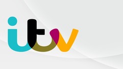
The new look has given the company a more ‘family feel’, due its colour and the font. The wide variety of colours has shown the audience that the channel is made with everyone in mind. The fluid font makes the company more family friendly with no over powering colours or shapes it makes the company look like it’s made for the whole family, which fits with the corporate identity.
 RSS Feed
